A prompt provides an easy way to offer assistance to your customers without needing to modify the layout of your website. Neocom offers three different prompt options:
Standard settings
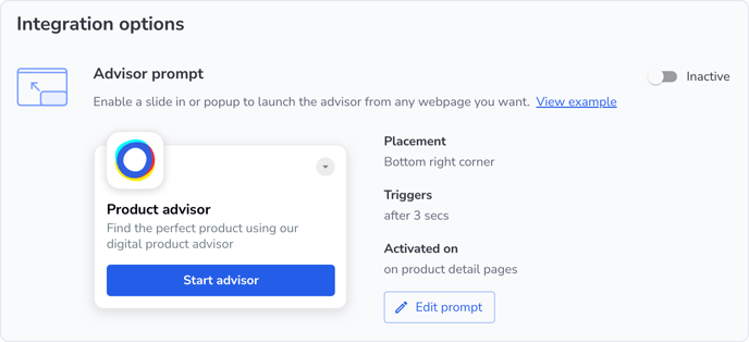
In the Admin Portal under Projects | Setup | Integration | Edit prompt, you can configure the basic settings for all prompt options.
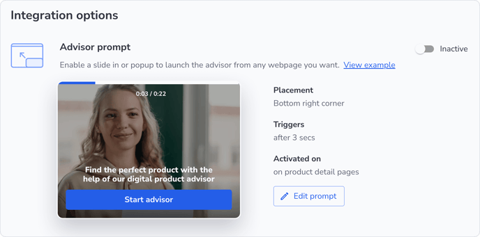
Activation
By default, the text prompt is enabled in the Neocom Admin Portal. You can toggle activation with the active/inactive switch. Clicking on edit prompt allows you to select between the various prompt options and customize them as needed.
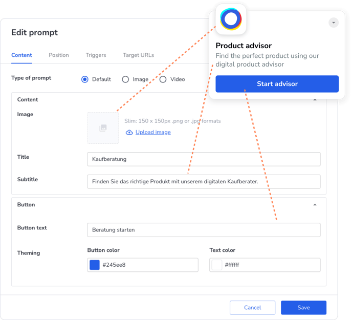
Content
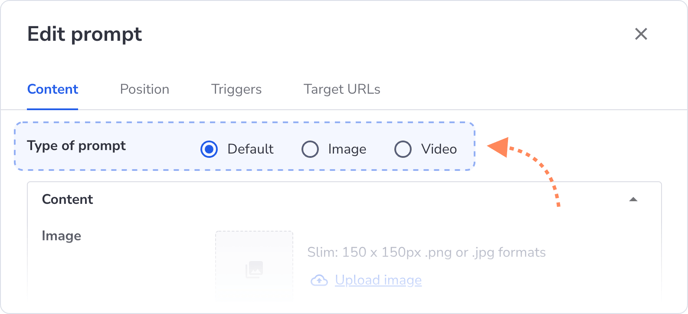
Under Content, choose which of the three prompt types you want to use. You can customize text, design, and other details to match your preferences.
Here are some tips for effective prompts:
- Have a short, crisp, and catchy headline to capture the user's attention
- Have a friendly tone, for example “Do you need help?”, “Can we help you find the best product?”, etc.
- Add a clear CTA in the form of a button so it's clear to the user that the pop-up can be clicked
Position
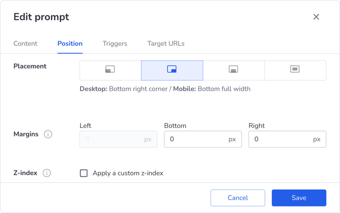
n the Placement section, you can decide where the pop-up will appear: bottom, left, center, or right. On mobile devices, the pop-up will fill the entire screen. Alternatively, you can display the pop-up as a module in the center of the screen, with the same behavior on both desktop and mobile.
With the Margins setting, you can adjust the spacing between the pop-up and the edges of the page to ensure it integrates seamlessly with your website. By default, the prompt has the highest z-index (2147483647), meaning it will appear above other elements. You can modify this value to place the prompt above or below existing HTML elements.
💡 The z-index is a CSS property that determines the stacking order of overlapping elements. A higher z-index ensures an element appears above one with a lower z-index.
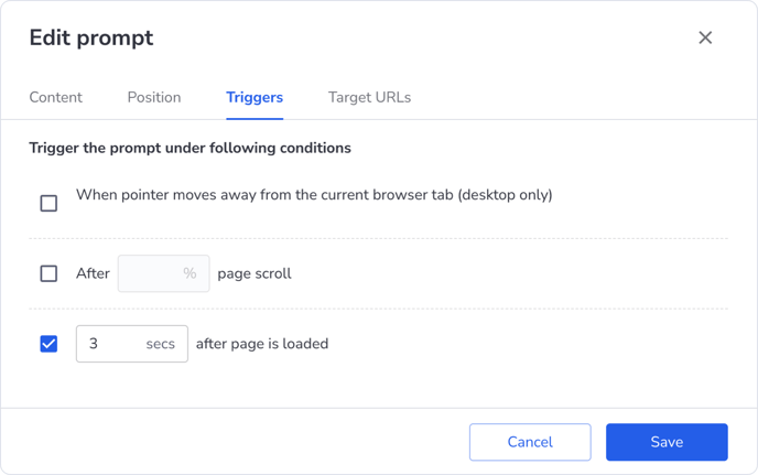
Triggers
Here, you can define the conditions for when the pop-up should appear:
- When the mouse pointer moves away from the current browser tab (exit intent — desktop only)
- After the user has scrolled down to a certain percentage of a webpage
- After certain time has elapsed after the page is loaded
You can select one or more of these triggers. If multiple triggers are chosen, the condition that is met first will cause the pop-up to appear. Once closed, the pop-up will not reappear on that page unless it is reloaded.
Target URLs
Here, you define whether the advisor should be displayed by default in the quiz or chat format – or whether an A/B test should be conducted with a 50/50 split between the two interface types.
You also determine on which pages the pop-up should appear. You have two options to choose from:
-
Automated: When activated, the pop-up will appear on all detail pages. You can enable or disable this feature using the active/inactive switch.
-
Manual: Using the Add rule feature, you can specify URLs where the pop-up should be shown. The rules offer several options:
-
is: The pop-up appears on URLs that exactly match your input.
- Example:
- Input:
https://www.yourwebsite.com/category - Shown on:
https://www.yourwebsite.com/category
- Input:
- Example:
-
contains: The pop-up appears on URLs that contain the input text.
- Example:
- Shown on:
https://www.yourwebsite.com/categoryorhttps://www.yourwebsite.com/category/productname, etc.
- Shown on:
- Example:
-
begins with: The pop-up appears on URLs that begin with certain words or characters.
- Example:
- Input:
https://www.yourwebsite - Shown on:
https://www.yourwebsite.comorhttps://www.yourwebsite.com/category/productname, etc.
- Input:
- Example:
-
matches: The pop-up appears on URLs that match a certain pattern.
-
Example:
- Input:
https://www.yourwebsite.com/cat* - Shown on:
https://www.yourwebsite.com/categoryorhttps://www.yourwebsite.com/catalog, etc.
- Input:
-
Note: If you select the matches rule and do not use a wildcard (
*), it behaves the same as the is rule.
-
-
Add exception
You can manually add URLs where the prompt should not appear. The same rules apply as outlined above. A common URL to exclude might include "neocom_source." This ensures that customers will not see the prompt after completing a consultation and landing on a product page (PDP).

Custom settings
Text (Default Setting)
This is the simplest prompt layout and comes pre-configured with generic text. However, you can upload your own logo, image, and modify the text and design under Content.
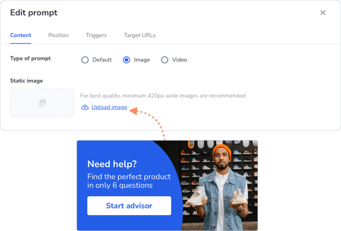
Image
One graphic, everything said. Design your custom graphic with CTA.
Recommended size: 840px width X 400 to 840px height
Minimum requirement: 420px width X 200px height
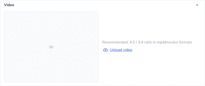
Video
The most personalized option, allowing you to address your customers directly. You can upload a video and customize it further.
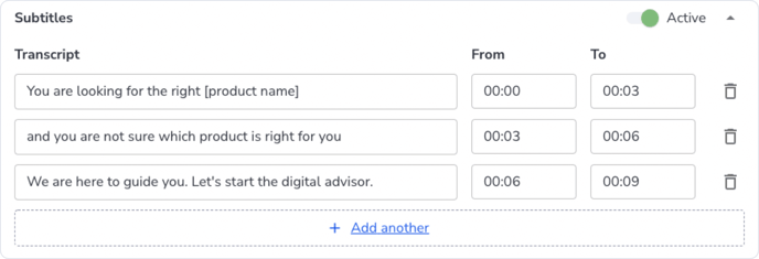
Under Content, you have the option to enable subtitles via the active/inactive switch. In the Subtitles | Transcript and From/To fields, you can add subtitles with precise timing.
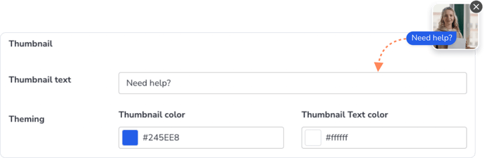
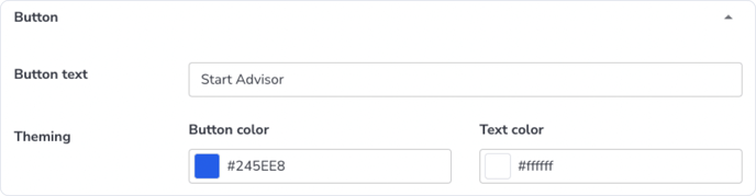
Additionally, under Theming, you can personalize the button text and colors, as well as the thumbnail.
Button:
Thumbnail — this is the small text that appears next to the prompt before clicking on it: