Adjust the design of your advisor individually
Neocom has enabled all users to personalize their advisors to fit the look and feel of their websites. The ease at which customization is possible also allows changes to be made quickly and easily, meaning updates for seasonal changes, sales, or other promotional activities are no problem.
Where to find the new Theme Designer
To find your personal Theme Designer, simply log into the Neocom Admin portal, choose the desired advisor, and then work your way to the Setup section which you will find along the top horizontal toolbar. Once in the Setup section, you will find Theme Designer along the vertical toolbar at the left edge of the page.
Preview, Save & Discard changes
Before we proceed, any changes you make to your advisors’ theme will only be saved and applied if you click on the Apply button. If you want to revert to the last saved version, press Discard. Nothing is saved until you have clicked Apply. If you try and exit the Theme Designer before saving, a prompt will appear asking you if you are sure to exit without saving.
The preview will always update automatically meaning you can see what your changes look like before applying or discarding. You can also toggle between Mobile, Tablet, and desktop views using the icons at the top right of the page.
This article covers many topics to help you navigate the extensive possibilities the Neocom Theme Designer offers. The topics we will include are:
It is always best to work your way from top to bottom when starting to theme your advisor as some of the changes you make here will affect elements throughout your advisor.
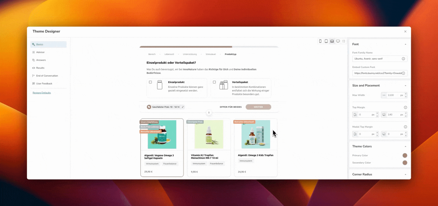
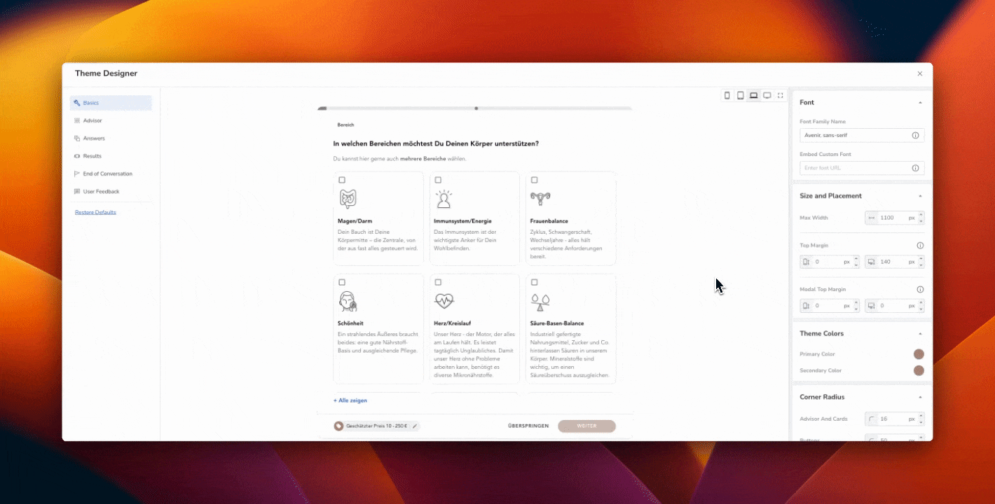
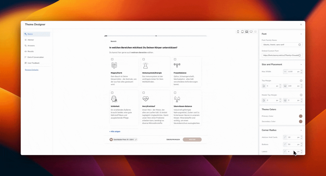
Basics
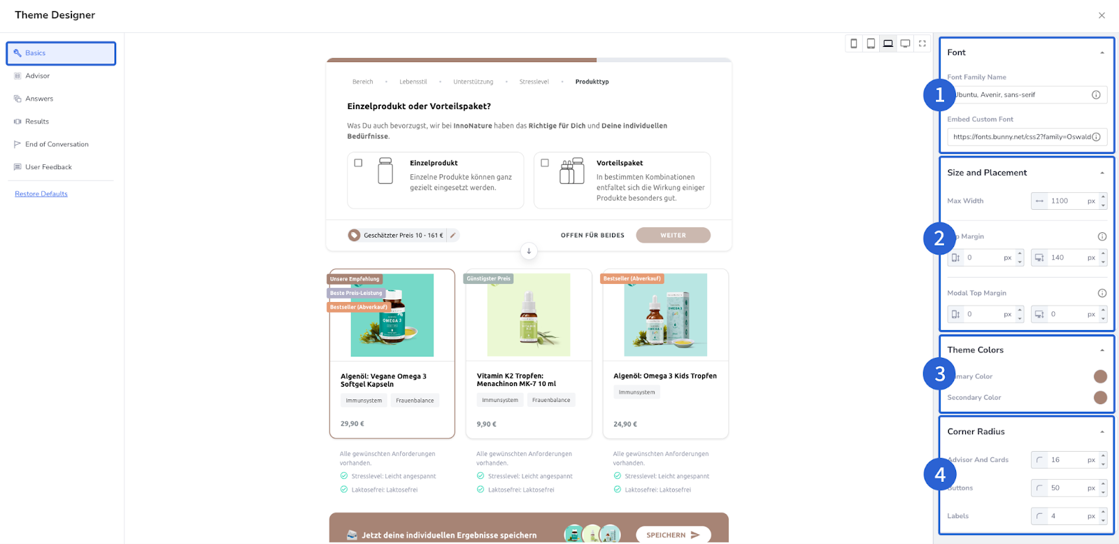
Your Font is one of the defining factors of your website, and your advisor. This is something that when implemented correctly evokes immediate brand recognition among potential customers.
Update the font:
Type the name of your desired font in the top box named Font Family Name. Following your preferred font, you must also enter at least one backup. As a backup, we suggest Sans Serif as this is a font that works on all browsers. You can also add multiple Backup fonts, each separated by a, (comma). The reason for the backup is that you may have a special font that you have saved on your hard drive but visitors to your site may not, meaning they would see the backup.
To ensure the font works for all visitors on all browsers, we have added a field where you can enter a custom URL containing a link to the font, called a CSS file. You can add this URL to the field named Embed Custom Font. This is the link that allows any computer, using any browser, to instantly download the required font. Your website also has a link to a CSS file so that your webpage loads with the correct font. You can use the URL your website uses, or generate a link from a GDPR-approved font provider. Bunny Font (https://fonts.bunny.net/) for example. Simply choose the font you want to use, add two sizes (400 & 700) by clicking Add Variant, then copy the URL.
Here is an example of what the CSS link should look like:
https://fonts.bunny.net/css?family=abel:400|abhaya-libre:400,700|are-you-serious:400|signika:400,700
Paste this URL into the Embed Custom Font box to ensure all visitors see the advisor, just as you intended.
2) Size & Placement
The Size & Placement section allows you to adjust the dimensions and positioning of your advisor so it fits seamlessly into your online presence.
Max Width adjusts the maximum width of your advisor to fit your website. If you don’t know what the max width of your site is you can use Google’s Developer Tools, found by clicking on the three dots to the right of the URL in your browser under More Tools, to inspect any element to find its width. The width is measured in pixels.
Top Margin allows you to shift the Inline Advisors up or down. This is particularly convenient if you have a toolbar at the top, or bottom, of the website that you don't want to obstruct. You can enter two values, one for Mobile and one for Desktop.
Modal Top Margin allows you to shift the Full Page Advisors down. Even though the advisor will be full screen, you may still want certain elements at the top visible, like a Header or Navigation Bar. Again, you can enter two values, one for Mobile and one for Desktop.
Each element has an information icon ⓘ to clarify during the adjustment process.
3) Theme Colors
At this stage, you can select both the Primary and Secondary Colors by using the eyedropper and entering an RGB, or HEX color code. You will see an example of the Primary color changing on the continue button or the price tag symbol for example, and the Secondary color changing the color of the text under the progress bar. These changes will affect various elements across all pages of your advisor from the initial questions to the results page. You can customize your color palette further, later in the process.
4) Corner Radius
This element allows you to adjust the corner radius of various elements of your advisor including the buttons and question cards (the card where you select your answer)
Advisor
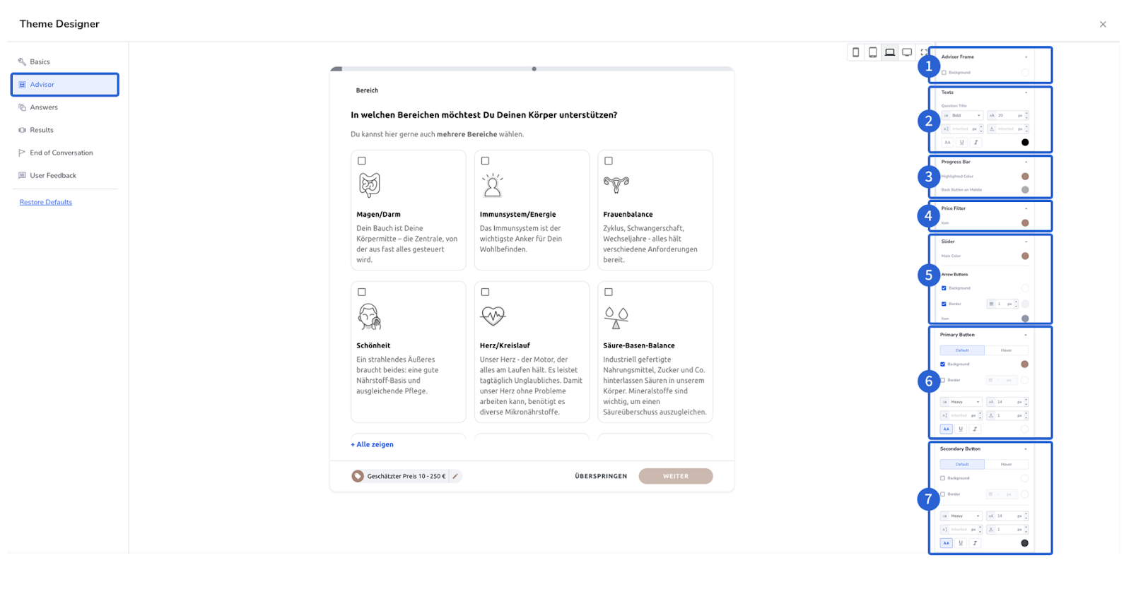
Here you can fine-tune the elements visible during the question portion of the advisor.
We will work from the top to the bottom of the options found on the right of the screen.
1) Advisor Frame: This adjusts the background color located behind the question box and the result cards.
2) Texts: Here you have the option of changing the weight and style of the question text.
3) Progress Bar: This is the bar that depicts your progress through the advisor at the very top of the page.
4) Price Filter: If you want to accentuate the price filter you can choose a new color for the price icon. If this is not adjusted it will remain the primary color selected earlier.
5) Slider: Here you can change all colors within the price filter. To see the changes you need to click on the price tag icon.

6) Primary Button: Allows you to change the color of the continue button or add a border if you wish. If you do not change this, it will continue to use the Primary Color selected earlier.
7) Secondary Button: You have all the same customizable options as with the Primary Button. For both the Primary and Secondary button options you can also adjust the font weight, font color, and font size. You also have the option to adjust the Hover Color. This means when users pass over the button with their mouse, the button changes color automatically.

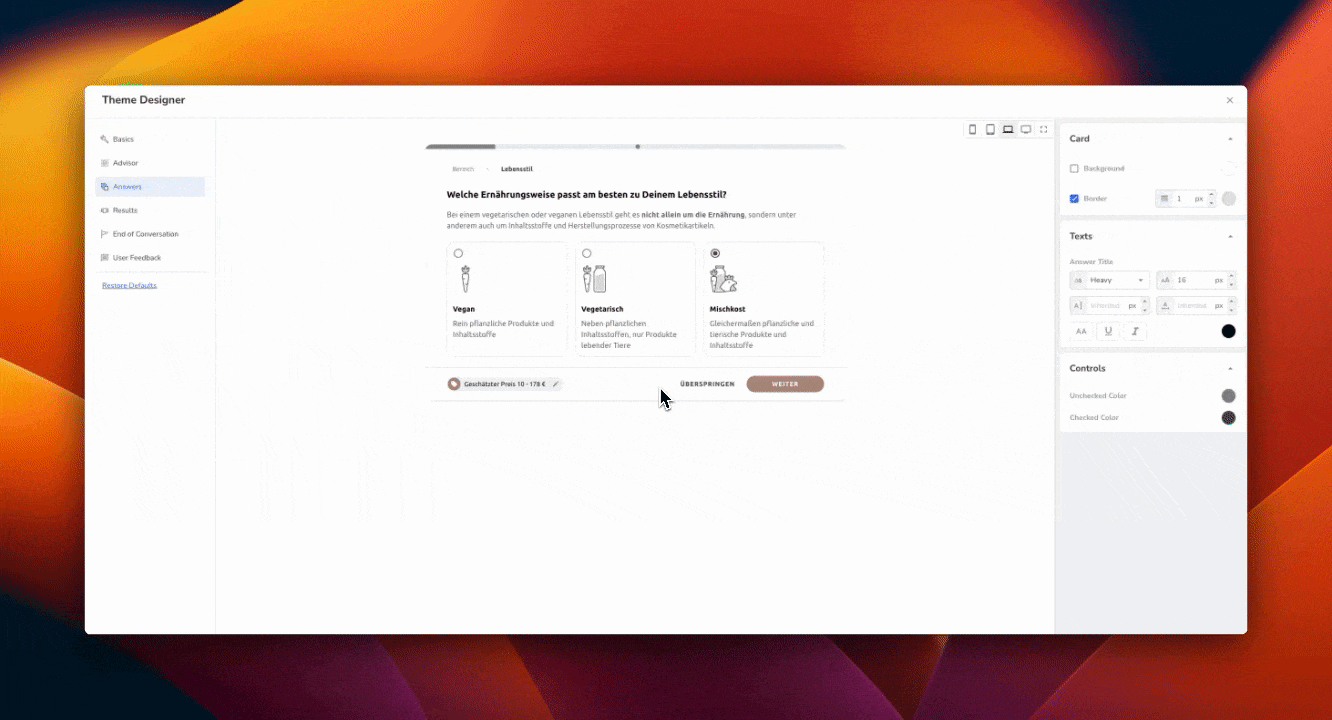
Answers
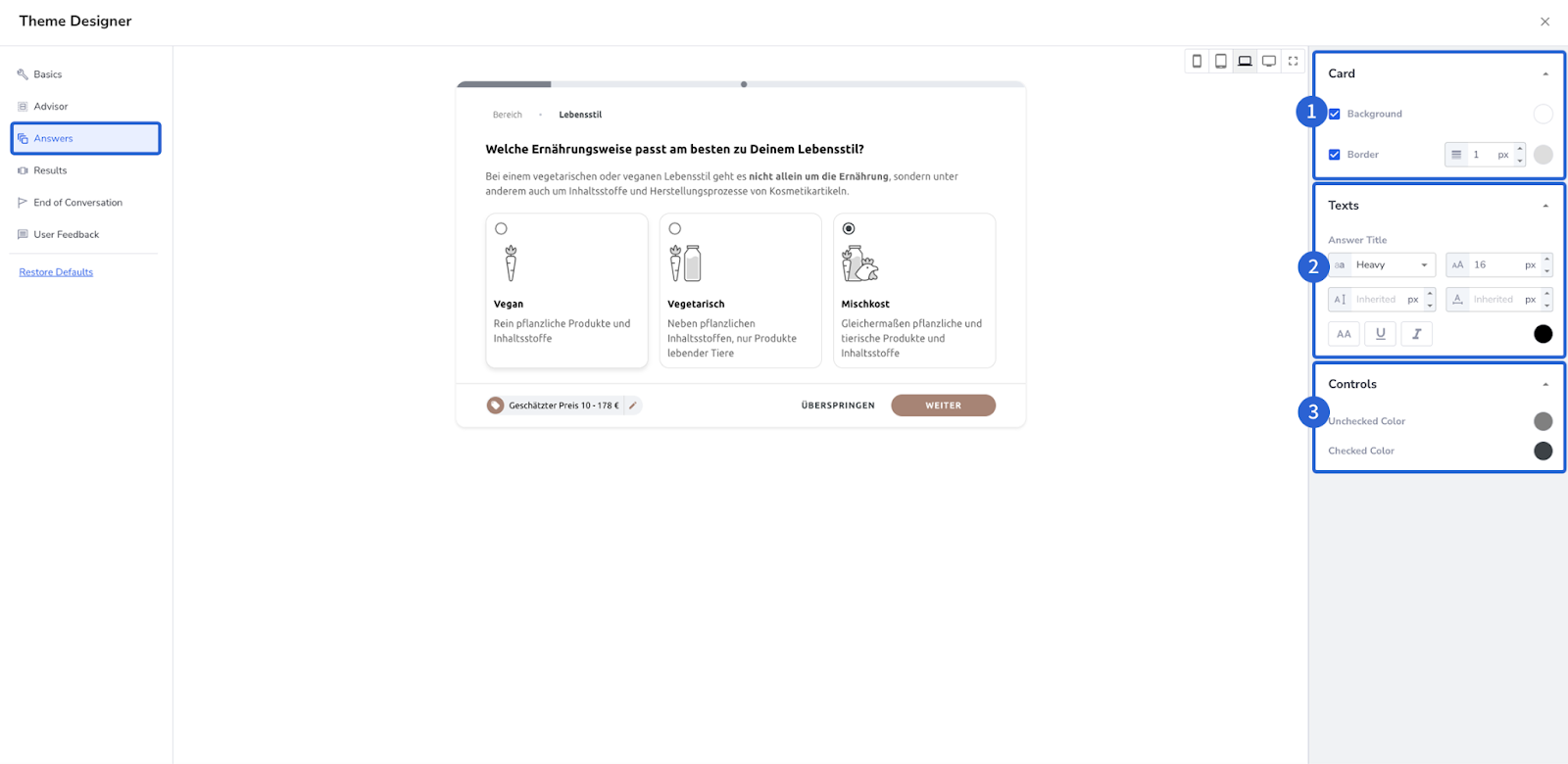
1) Card: The Card section lets you customize the answer cards. Each of the answers, to each question, are positioned on what is called a card which are completely individualizable. In this section, you can adjust the background color and the border.
2) Text: Like all the other sections, this is your opportunity to customize the font on each card. You can adjust size, make text Bold, add Italics, whatever you wish.
3) Controls: Customers must click on the card to select that specific answer and move on with the advisor. With the Controls section you can adjust what color should be displayed if the card is selected or not.

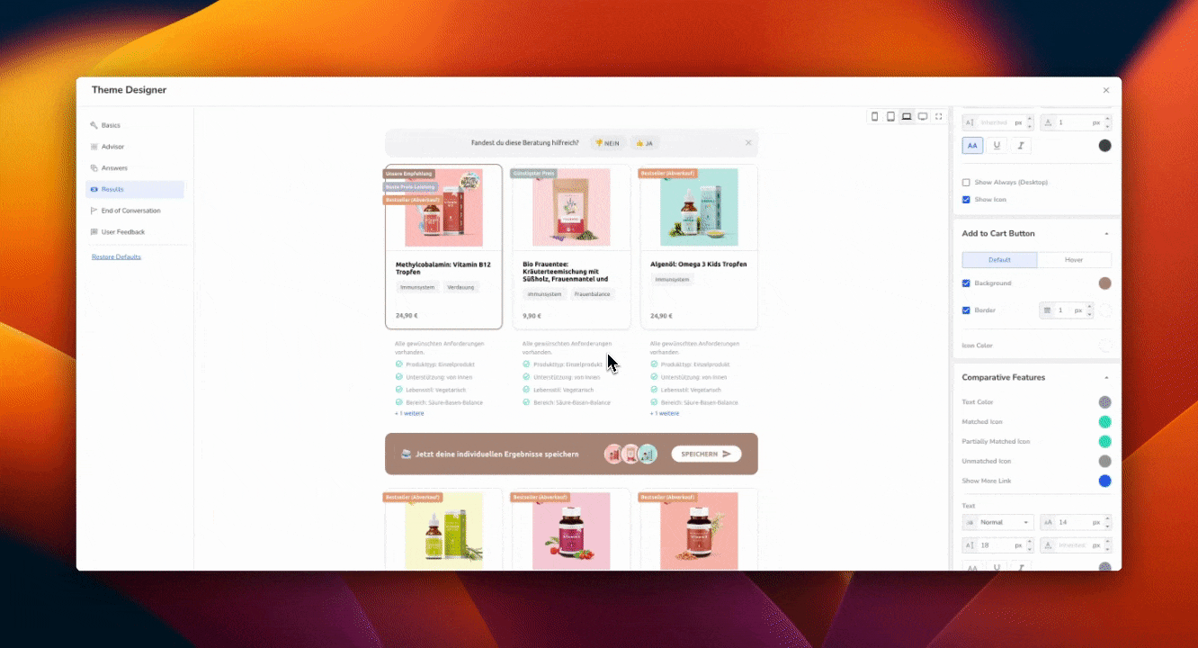
Results
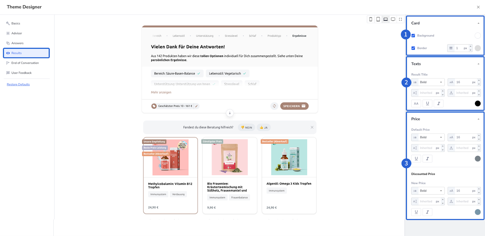
1) Card: This refers to the individual result cards (as seen above with the highlighted border) You can adjust the background color of each result card, add borders, and adjust the border width.
2) Text: Refers to the title text of each result Card. You can adjust the size or color and add bold or italics effects. The font itself is always coupled with the font you added in step one.
3) Price: Here you can adjust the standard price, the sale price, and the strike-through price, as well as the price prefix and suffix ($ / € for example).
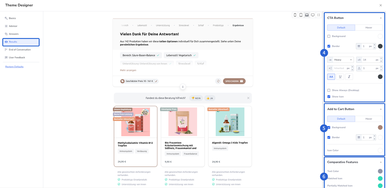
4) CTA Button: This is the button that will drive visitors to the Product detail page on your website. Setting up a clear look for this button will make the journey clearer for customers and drive customers to checkout. As with other elements, you can adjust the background, border, font color, font size, and weight.
5) Add to Cart: This button sends the selected product directly to the clients' Cart, meaning it is a button that you want to draw attention to while still keeping in line with your online style guide. This feature requires extra information within the feed you supply to Neocom. If you are curious, reach out and contact your Customer Success Manager.
6) Comparative Features: These are located underneath each result card. Here you can adjust the color of the ticks which are visible when a product meets the requirements selected in the advisor. You can also adjust the color of the icon chosen to represent those features that the product does not possess. Just like the other sections, you can also adjust the font size and weight at this point.
End of Conversation
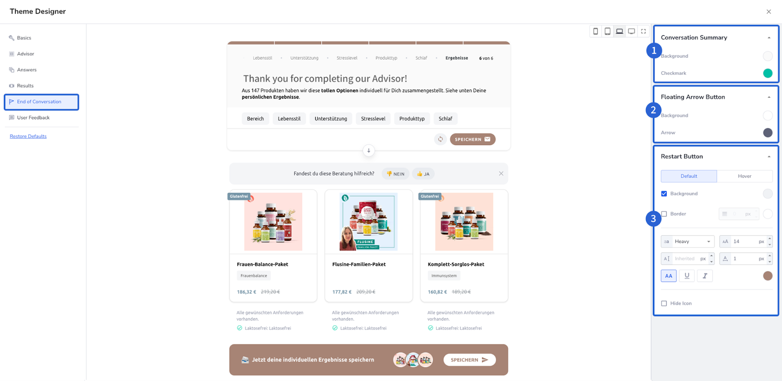
The End of Conversation section looks at what users see when they finish the advisor, predominantly what is displayed where the questions were previously.
1) Conversation Summary: Here you can adjust the background color of the entire result section, as well as the checkmark displayed. Each checkmark indicates each question that the user answered, and doubles as a link to return to that specific question.
2) Floating Arrow Button: This refers to the floating arrow button, centrally located below the text. This block allows you to change the color of the background, and the arrow itself.
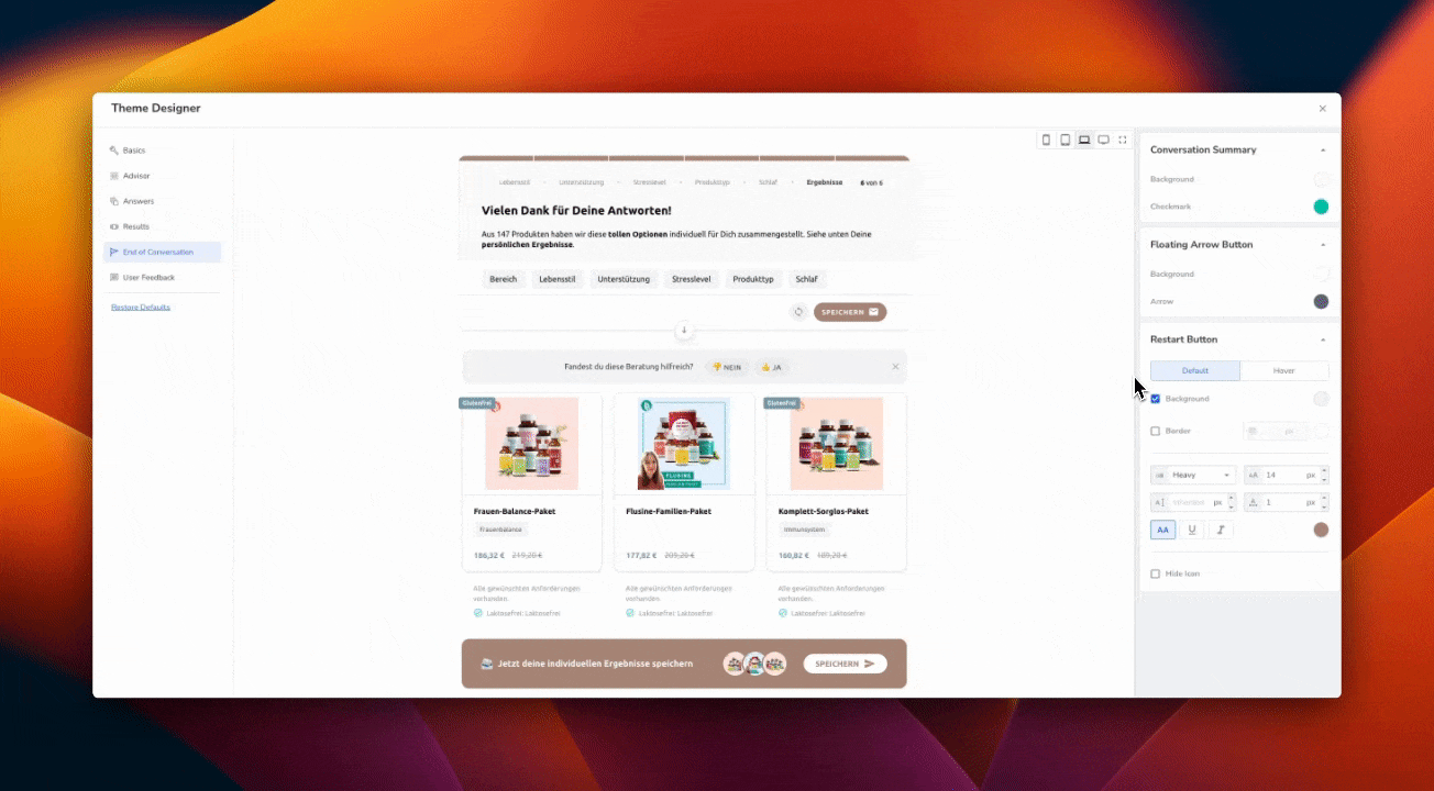
3) Restart Button: The Restart button is located at the bottom right. Again, you can adjust the color of the text, the icon, and the background, as well as the font weight and size. You also can hide the icon altogether.
User Feedback
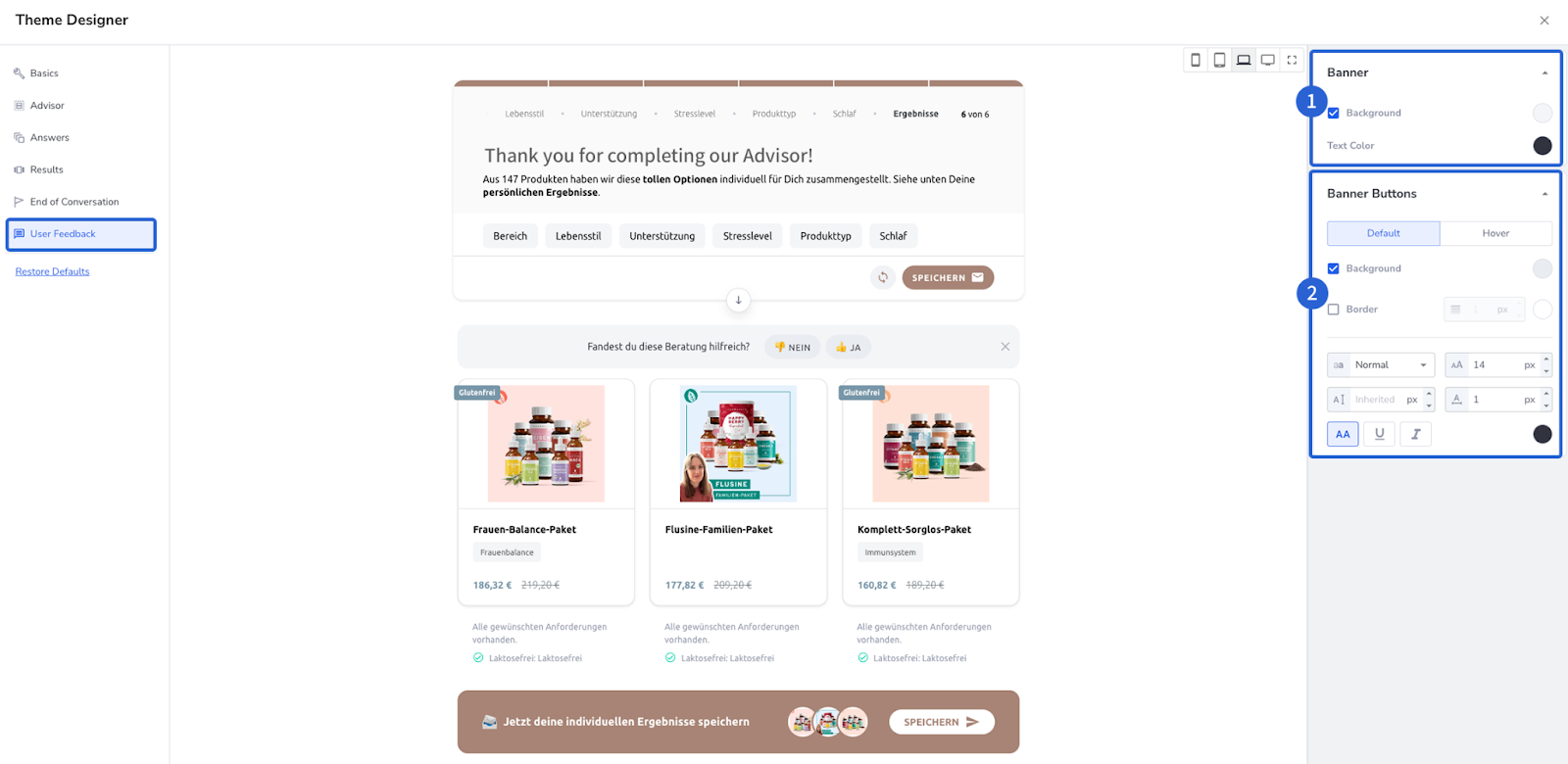
1) Banner: Here you have the chance to define the background color of the User Feedback section, as well as the displayed Text color
2) Banner Buttons: This enables you to adjust the font weight and size as well as add borders for the Thumbs Up | Thumbs Down buttons.
Tips & Tricks
Keep it simple.
You have almost unlimited possibilities, but we recommend you refrain. Keep the look and feel of the advisor in line with the look and feel of your website. Accentuate a small number of elements to guide potential users to their perfect product without cluttering the overlook of the advisor. Focus on getting the basics correct. Take more time to correctly adjust the size & positioning and make sure the font, primary & secondary colors are correctly set.
Baby Steps.
Tweak one or two elements, review them, and then apply them. In the Theme Designer, you can instantly see how these adjustments look. By making gradual changes, you minimize the risk of unintended modifications and ensure that each adjustment aligns precisely with your vision.